Flutter Raised Button in Detail

‘RaisedButton’ is a widget used to create material design ‘raised button in Flutter. It’s Material.elevation increases when the button is pressed. It adds dimension to otherwise flat layout buttons and gives our UI a totally another look. So let’s dive in and create some awesome buttons in flutter ➡️
RaisedButton Class
RaisedButton class provides many properties to configure the button viz:
const RaisedButton({
  Key key,
  @required this.onPressed,
  this.enabled,
  this.color,
  this.highlightColor,
  this.splashColor,
  this.disabledColor,
  this.elevation: 5.0,
  this.highlightElevation: 10.0,
  this.disabledElevation: 0.0,
  this.colorBrightness,
  this.animationDuration,
  this.disabledTextColor,
  this.hoverColor,
  this.hoverElevation,
  this.onLongPress,
  this.textColor,
  this.textTheme,
  this.shape,
  this.padding,
  this.child,
}) : super(key: key);- enabled — Bool value that tells whether the button is enabled or disabled.
- onPressed — The callback that is called when the button is tapped or activated.
- color — Sets the background color of the button
- highlightColor — Sets the highlight color of the button’s InkWell. InkWell is a rectangular area of Material that responds to touch. To know more about it Click Here. Simply, we can say that it sets the highlight color of the expanding circle effect that appears on tapping the button.

- splashColor — Sets the splash color of the button’s InkWell.
- disabledColor — Sets the background color of a disabled button.
- elevation — It is a double value used to set the elevation of the button.
- highlightElevation — It’s a double value that sets the button’s material's elevation relative to its parent when the button is enabled and pressed.
- disabledElevation — It’s a double value that sets the elevation of a disabled button i.e when the button is not enabled.
- colorBrightness — The theme brightness to be used for this button.
- animationDuration — It defines the duration of animation effects for shape changes and elevation.
- disabledTextColor — It sets the color for the text when the button is disabled.
- hoverColor — The background color of the button when a pointer is hovering over it.
- hoverElevation — It sets the elevation of the button’s Material relative to its parent when the button is enabled and a pointer is hovering over it.
- onLongPress — The callback that is called when the button is long pressed.
- textColor — The color to be used for the button’s text.
- textTheme — The TextTheme to be used for the button’s text.
- shape — It is used to set the shape of the button’s material.
- padding — Sets the padding for the button.
Creating a simple Raised Button
The below code creates a simple RaisedButton:

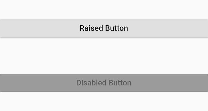
For creating a disabled button we need to set the enabled property to false or we can set onPressed to null i.e setting enabled: false, OR onPressed: null,
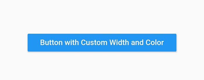
Creating a button with custom width and color
For setting the width of the button it needs to be put inside a container and then the width of the container is set.
The above code creates the following button:

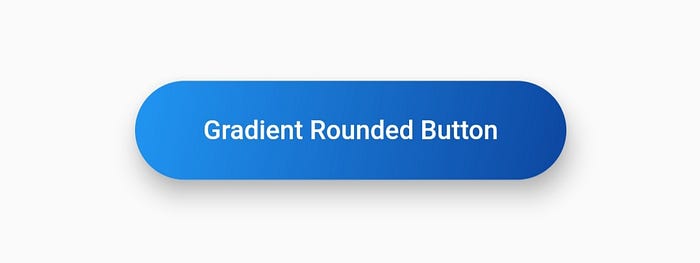
Creating a Rounded button with padding
For making a rounded button we use shape property of the RaisedButton For rounded corners we use RoundedRectangleBorder()

Creating a Gradient Button
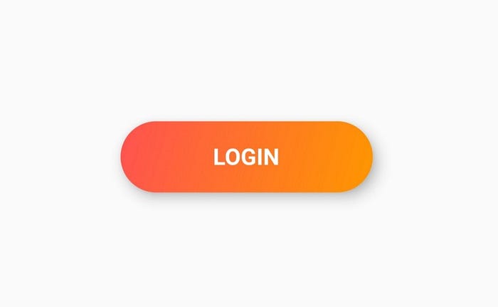
For creating a gradient button we use Ink() as a child of the RaisedButton as there is no direct way of creating a gradient. In the Ink() class under the decoration property we use BoxDecoration() and rest is similar to creating a gradient using BoxDecoration()

Hope this article helps you in some form or the other. Clap your hands 👏 if it does or clap multiple times 👏 👏 👏 if you loved this article 😄
Play around with code and create awesome buttons. DM me what you create. Always eager to hear from creative developers.
Do comment if you find something to be incorrect.
See ya 👋
